I Was A Teenage Frankenstein
Review by NekroDave
It didn't take long for A.I.P. to follow up the success of I Was A Teenage Werewolf with similarly titled I Was A Teenage Frankenstein. In fact, it was released the very same year.
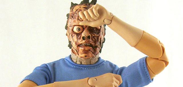
As with "Teenage Werewolf", "Teenage Frankenstein" gets it's own 12" figure this year from B.F.F.F. International. Sadly, the result is nowhere near as good. When I first saw prototype pics of this one, I had decided I would pass on it. Unlike most 12" dolls on the market, this character actually wears a short sleeved shirt. This means that there is lots of visible joints in the "skin" that look very unrealistic. This wasn't the issue I had with it though. What bothered me was that the upper and lower arms didn't match in color. So, I figured it was best to wait to see the final product.
But some months later, when images of the box art surfaced, I broke down, decided to trust in humanity and assume that the problem would be fixed. I mean, how can something like that possibly get green-lighted, right? Well, the figure arrived and lo and behold, no change from the prototype at all!
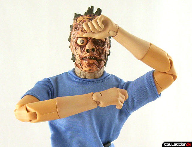
I couldn't help but think back to an anecdote I heard on a Simpsons commentary about how they got their animation back from Korea one time to see that a piece of fruit was colored wrong, because it was not known in Korea. Well, this figure is made in China and while I've never been to China, I have met Chinese people and near as I can tell, their arms were always uniform in color, top to bottom. So I'm not sure how to justify this...
The rest of the figure is fine. The sculpt and paint of the head is nice and the clothes simple but effective. But no matter how I try, I just can't get my head around this...
Well, since I don't like to write an entirely negative review, I will say I do like the box a lot.
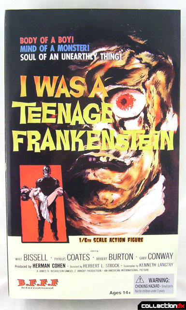 Box Front Box Front |
 Box Interior Box Interior |
 Box Back Box Back |
But I don't really like it enough to make up for this...
Always trust your instincts...
Comments
4 comments postedThat's one creepy looking face sculpt!
LF
Leonardo Flores
CollectionDX Staff Writer-West Coast Bureau
I love the use of that pic four times!!
Tell us how you really feel, Dave! ;)
Anyway, I'm sure that effect is actually lessened in these pics. With the bright, diffused lighting, the color difference between the forearms and upper arms doesn't seem that bad, but in person, I'll bet it's pretty horrible.
The other thing that throws me off is the neck. Is it me, or does it seem grey? Is it supposed to be that way??
--
Sanjeev
Thanks. I sort of felt that pic basically told you all you really needed to know, so why not have some fun with it? ;)
The neck is fine, though. If you look closely in the trailer, the character seems to have a sort of neck brace on, so that is why it looks like that.
"This must be settled the way nature intended....with a vicious, bloody fight!"
Onyx Blackman
Principal, Flatpoint High
Ah, okay...I see that now!
Still...non-matched arms...on a short-sleeved doll? Booo...
--
Sanjeev